Let me first preface this post with… anytime you are building or renovating, there are going to be frustrating moments where something doesn’t go as planned or an idea or vision you had is shot down or needs to be advocated for. That is sort of where we are right now and after speaking with some of you about your personal experiences, this is just the reality- more times than not, if you want something a bit out of the norm/standard, you have to advocate for your design choices a bit more than you may have thought you would have to. My advice? Do your research, stay true to your aesthetic, and advocate for yourself. AND if something happens and you have to pivot, then pivot gracefully and remember that in 10 years from now, maybe this little detail you are obsessing over now won’t matter as much.
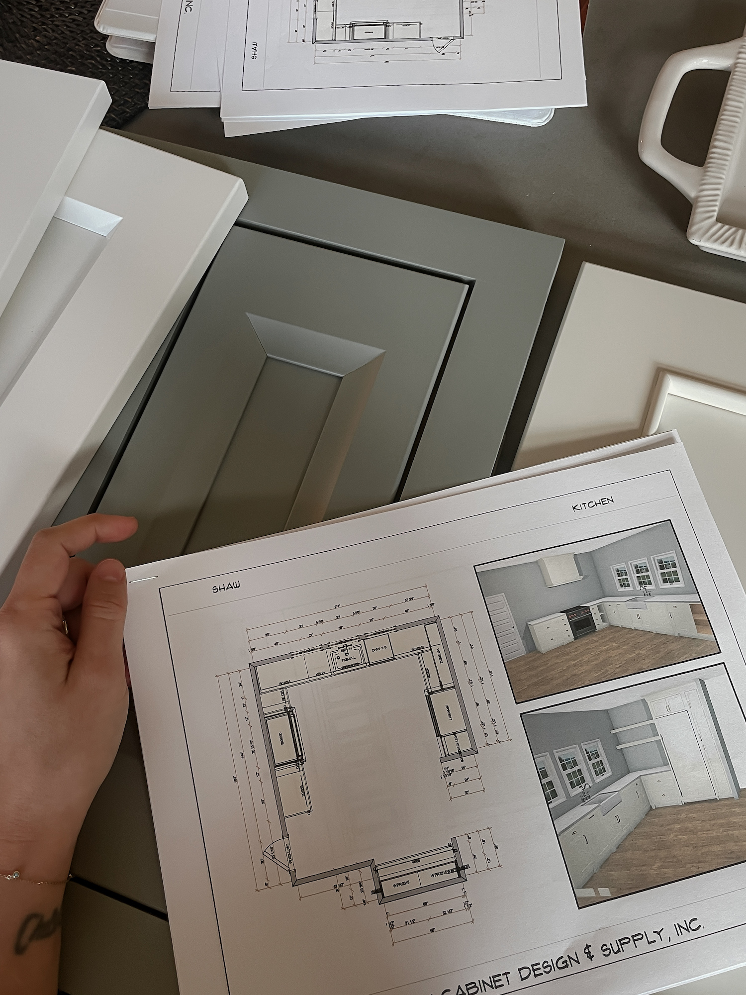
Whew… ok, let’s get to it. I had a preliminary meeting with a cabinet maker this week who I am pretty sure we are going to go with for our new build and I thought it would be a good time to show you our design inspiration for the kitchen and also chat a bit about budget, inset vs overlay cabinets, 2 cm vs 3 cm countertops, little ways to add character, and my thoughts so far on the process.
The Inspiration
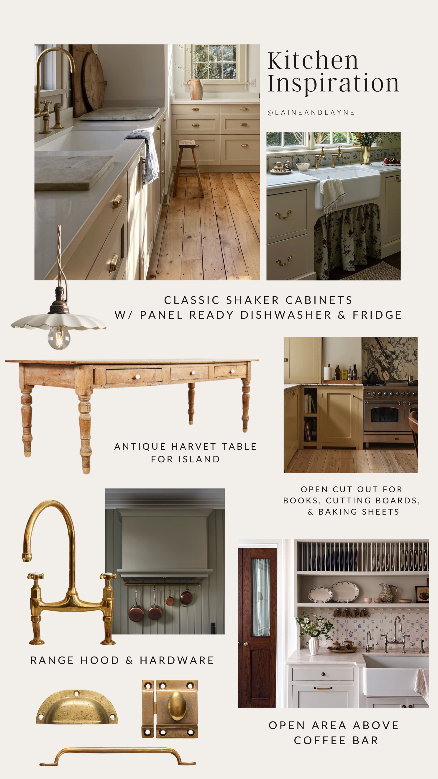
Inspiration Board Sources : @burtsbrisplease, Carley Summers, deVOL Kitchens, Basic Projects photographed by Nicole Franzen
You can see above we are doing a more traditional kitchen with a classic shaker style cabinet- contrary to some, I think it is a beautiful and simple style cabinet that I know I won’t tire of. My goal for the kitchen is for it to be beautiful, but to feel lived in and exude warmth and character. The kitchen is the one room we spend most of our time, with three children and cooking almost three times a day, everyday, I want this space to be a reflection of our family, for our family.
Inset vs Overlay
I was dead set on doing inset cabinetry. We have custom inset cabinets in our current home and I love the look of them, but after going over the numbers today and looking at various options, I came to realize I am not opposed to sacrificing inset cabinets for overlay if that meant being able to have a larger budget for other customizations, hardware, appliances…
Cabinetry design is so important and contributes so much to the overall aesthetic of the kitchen. That said, the craftsmanship and installation is also just as important. The cabinets will still be solid Maple, dovetail drawer details, soft-close Blum hinges, custom painted finish… but by choosing overlay, we are able to save close to $4k, which when working with a budget is a decent amount of money that can go towards something else.
Customizations
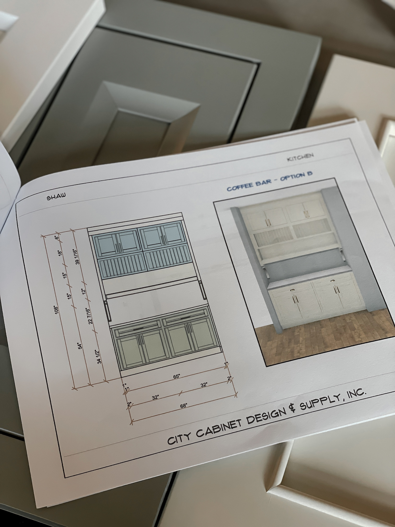
One of my favorite custom features is the coffee bar area, which you can see below, with a plate rack, open shelf, upper cabinets, corbels, and butcher block countertop.
People often overlook the toe kick area of cabinets but this is one easy way to add so much character to your kitchen! Right now I am trying to decide on what toe kick I want in the kitchen. If doing inset, I would do standard feet with a recessed toe kick, but since you will not be seeing any frame of the cabinet bases with overlay, we most likely will do a decorative baseboard toe kick that isn’t recessed that looks more like a furniture piece. I will however do either an open valance toe kick below the sink or have an opening in the cabinet and hang a counter curtain like in the inspiration board above. This way I don’t have to worry about foot traffic while using the sink.
Another way I am adding character is by including an open cut out in our cabinet for books, cutting boards… which you can also see in the inspiration photo above.
We are still deciding on a cabinet color which will be an entirely separate blogpost, but I know I want to do a custom color either a creamy white or neutral beige/white. I do know I am hesitant to go with a manufactured cabinet color and not be able to accurately match our contrast trim in the house. So many little decisions…
Hardware is another way to add the character you want- hardware can completely change the look of a kitchen. You can go with painted wood knobs for a more English cottage aesthetic, unlacquered brass hardware that will age with use overtime, modern brass or black hardware… so many different options depending on your design goal.
Countertop edge profile is another way to add character. Instead of your basic eased countertop edge which is what we have in our kitchen now, you can opt for something with more detail and character. For the traditional look we are going for, we are looking at doing either a full bullnose or ogee edge.
Countertops
I have been extremely determined on doing a natural stone countertop like Marble. I want a stone that will age, stain, etch, and show signs of living overtime. Quartzite and Granite are also other natural stone options depending on budget that can give you a similar look to Marble. Regarding thickness, I want a 2cm countertop instead of the standard 3cm, because I like the thinner profile and overall look. I expressed this with our cabinet designer because I have researched that when doing 2cm, the cabinets will need to have a recessed piece of plywood installed for countertop support. After speaking with her, she says their cabinets do not need any additional support and the fabricator highly discourages 2cm with natural stone due to cracking. Additionally the fabricator mentioned a 90% chance of cracking with 2cm during install or years down the road… obviously, I do not want to spend thousands of dollars on a countertop to then have to worry about it cracking at some point. That said, I am going to get 2 or 3 more opinions from other fabricators and make a decision after that. This is a perfect example of having to advocate for what you want. If you have a 2cm natural stone installed in your kitchen, I would love to hear your thoughts!
