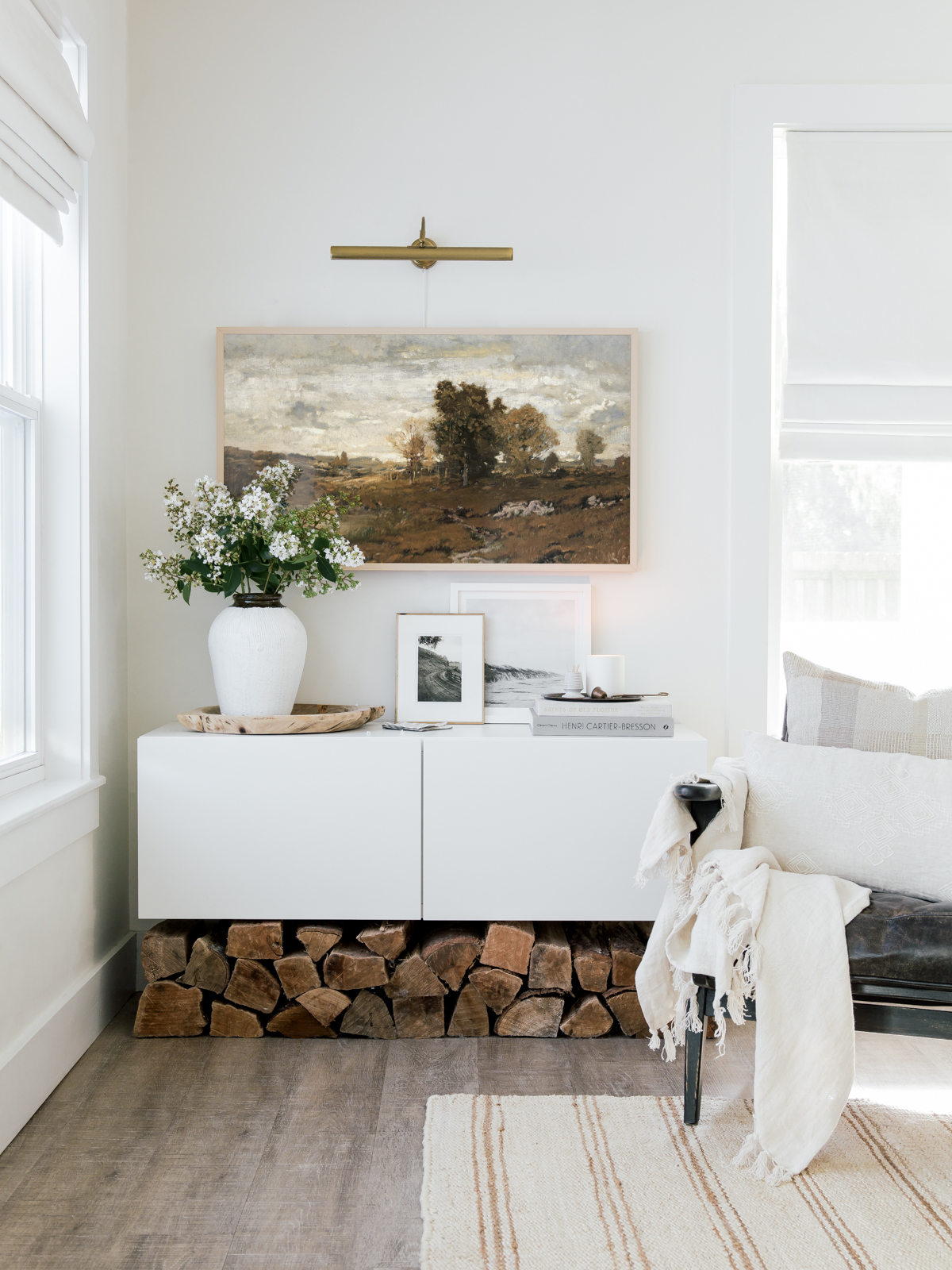
After sharing this space in our living room of our new media cabinet and TV, one of the most frequently asked questions that pops up in our DMs on Instagram is about our TV/artwork.
Get The Look
Yes, that large artwork in actually a 43″ TV and it is one of our favorite purchases in our home! We recently updated this area by restyling the media cabinet and adding an inexpensive plug-in LED picture light above the TV which was just what this space needed! We installed the IKEA ARSTID Brass Picture Light, but it is no longer available on the US site, only the nickel color is available- but you could always purchase the nickel and spray paint it!
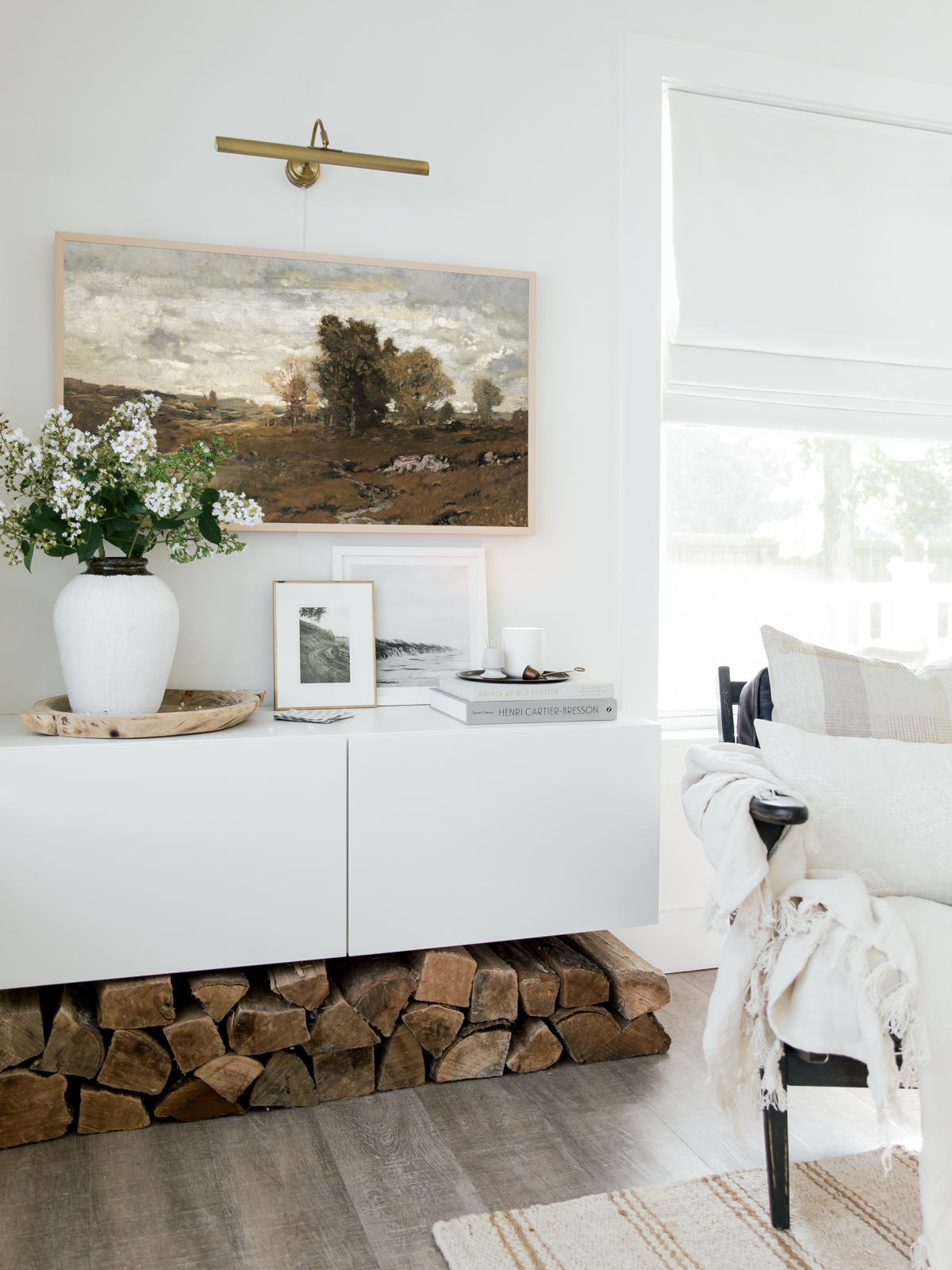
We have been gravitating towards warmer wood tones lately and switched out our TV artwork with this vintage art to reflect that. Although we are anxiously anticipating fall (hence the warmer tones), we are loving the beauty these Crepe Myrtle blooms bring during the summertime.
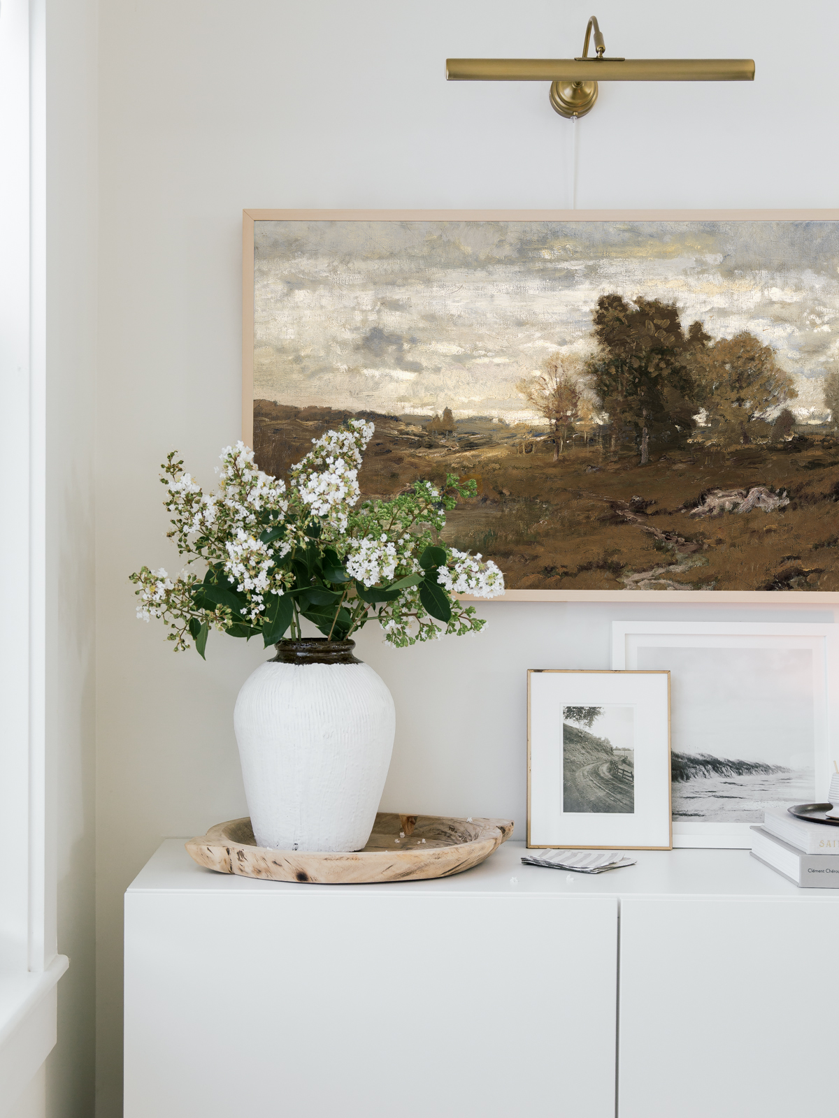
We often are asked how we resize and upload the digital art to our TV so it is full-frame with no modern mat or shadowbox mat– (we have seen this done in a much easier way, but we find the Smart Things app can be a bit finicky for us at times) We resize our art in Photoshop to these exact dimensions 7680×4320, and then put the art on a flash drive and plug the drive right into the TV box. Once your artwork pops up and you select and save your art, you can then go into options and select ‘no mat‘.
Below is a roundup of some of our favorite vintage digital art for The Frame TV.
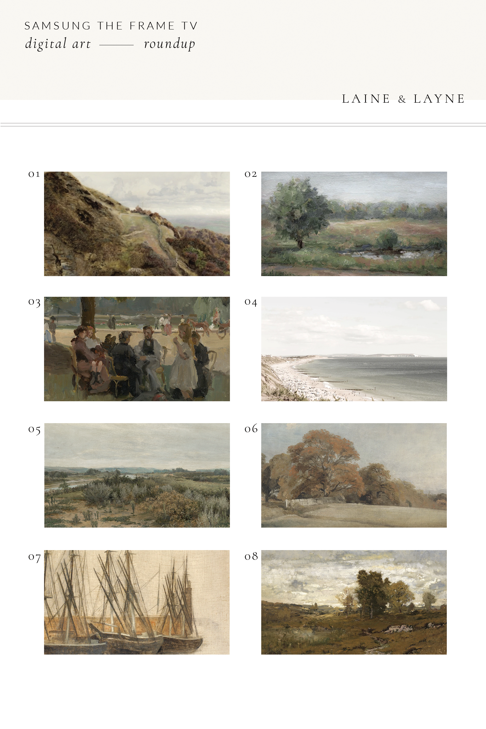
Shop Digital Art
click on the numbers below to shop the corresponding art
01 / 02 / 03 / 04 / 05 / 06 / 07 / 08
*Digital Downloads 01 – 04 are buy one get one free, no code needed
Here is another tip- if you download any of the vintage art and feel the colors are too vibrant or too yellow or orange, etc… you can desaturate the image a bit in Photoshop or in the Lightroom app on your phone. A lot of the times we will just desaturate the yellow or green tones in the image so it is a bit more neutral for our space.
We hope you enjoyed this art roundup post!
