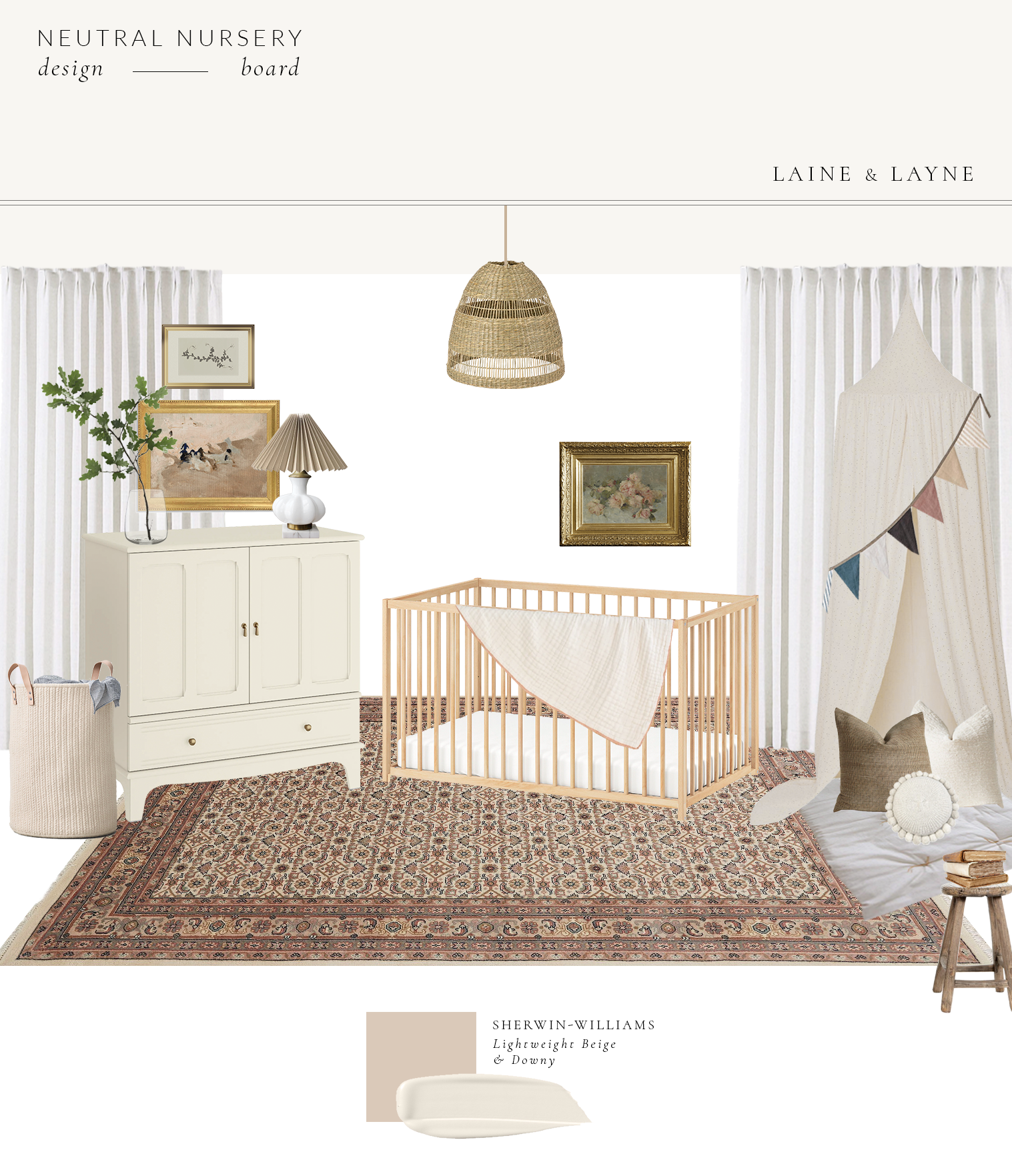
Surprise! Today, we are sharing our little girl’s neutral nursery design! If you have been following along on Instagram, you know we have been working on transforming this little room from our toddler’s bed/playroom to the nursery. If you want to see what this room looked like before, click here. We moved our boys into the same room and have been redoing their room as well- hoping to have that reveal go live in the next week or so!
Ok, back to the nursery…

*all sources are linked at the end of the post
What inspired this entire design was the one-of-a-kind rug by Revival Rugs. They have the most beautiful vintage (and new) rugs at attainable prices and we couldn’t be more thrilled to be partnering with them on this project. We chose this rug for it’s soft and feminine color palette, and can honestly say the colors and quality blew us away when it arrived! If you want to see their similar rugs that we sourced, be sure to check out their rugs named Grant, Monterey, Marquette and Albion or view our Nursery highlight on our Instagram profile, here. We also have an exclusive discount code for all of our readers- just use code LAINEANDLAYNE10 at checkout for 10% off!
We didn’t have the opportunity to create a nursery space with our last baby because this room was our dedicated office/storage space, so we are so excited we finally have the chance to create a beautiful space for our last babe. We overall wanted the aesthetic of her room to be modern vintage with neutral and feminine tones. I went back and forth on trying to find the perfect paint color for the walls… this room is one of the darkest rooms in our home with beautiful light only peering in right around lunchtime.

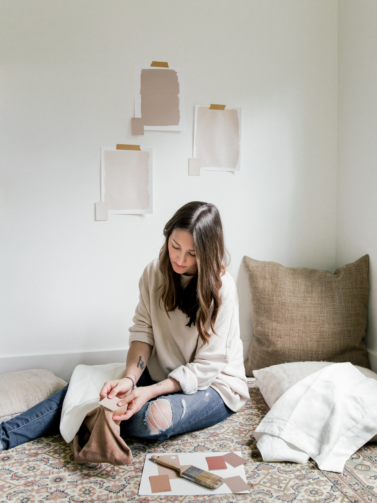
I contemplated a darker color, but who am I kidding… I knew I wouldn’t be happy longer than a week with a more saturated color on the walls. I then contemplated doing a contrast trim where the trim is painted darker than the walls, but decided against it since this would be the only room with contrast trim and would make it not cohesive with the rest of our home. So, we ultimately landed on a beautiful creamy white with red undertones- Downy by Sherwin-Williams. Our current paint color as seen in the photo above is Benjamin Moore White Dove which has yellow undertones and with it being a low-lit room surrounded by shaded trees and greenery, the room was just coming off blah. It’s amazing how just choosing a paint with the right undertones can be exactly what the room needs! We are also going to accent a few pieces in the room with the Lightweight Beige color as well.
We just finished painting today (woohoo!) and our curtains and other finishing touches are arriving early next week! Follow along on Instagram- @laineandlayne if you want to watch us style and photograph this space!
Sources
- Rug (use code LAINEANDLAYNE10 for 10% off)
- Curtains
- Cabinet
- Crib
- Canopy/Reading Nook
- Linen Bunting
- Play Mat
- Pillow 1, 2, & 3
- Seagrass Pendant
- Lamp- Vintage
- Lampshade
- Glass Vase
- Floral Art above Crib
- Large Art above Cabinet (use code LAINEANDLAYNE for 20% off)
- Drawing above Cabinet
- Hamper
- Heirloom Blanket
- Vintage Stool


[…] Like with any room, rugs can be the foundation piece in any design. We first started by sourcing this beautiful, vintage-inspired, one of a kind rug by Revival Rugs, and designed the nursery around it- from the colors sourced, furniture, natural and textural elements, and hand-made pieces like the mobile, artwork, and play mat. If you missed the Neutral Nursery Design Plan blog post, you can read that here. […]